Chrome’s mobile emulation tool has many uses for marketers and developers – especially given Google’s recent focus on mobile usability as part of their mobile organic ranking algorithm.
You may think a simple check on your personal mobile device will tell you if your site is mobile-friendly or not. But with so many smartphones and tablets on the market, chances are your target audience is using all of them to visit your website.
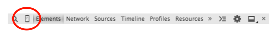
An easy way to check your mobile site usability on different mobile devices is built right into Google Chrome! To access the mobile emulation tool, simply navigate to your website in your Chrome browser, right-click anywhere on the page, and choose Inspect Element.

Click on the Toggle Device Mode icon, circled below.
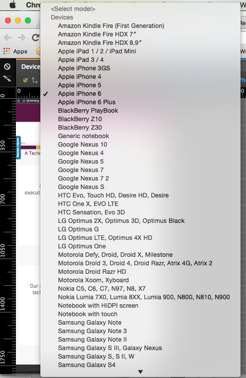
At the top left of the window, click the dropdown menu next to Device to display a full list of smartphones and tablets. Select a device from the list. Refresh the page.
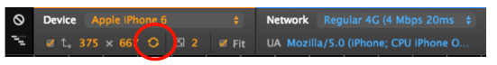
In the image below, you’ll see how Clarity Quest’s homepage appears on an iPhone 6. You’ll also notice your mouse turns into a gray dot when hovering over the mobile preview. This is meant to replicate a finger on the touchscreen. Hold down shift while using the mouse to replicate the pinch-to-zoom function on a mobile device.

Scroll through each page of your website to make sure all elements are appearing and functioning properly. Be sure to test the navigation, images, videos, etc. to ensure your website provides a seamless mobile experience.
You can also switch between landscape and portrait mode by clicking the button circled below. Testing different networks (e.g. 3G, 4G, wifi, etc.) will show you if your site suffers from any lag time or speed issues.
Developers can even play with the CSS and see a live preview of how the changes will impact the form and function of the mobile site. There are many other functions in this great free tool, so dive in and learn more! As always, let us know if you have any questions about mobile responsive website design.