Google’s new search results page layout is now live for all users. Although the change is still new, the criticism is widespread. Most bloggers and industry thought leaders say the new layout is a step in the wrong direction for the world’s leading search engine.
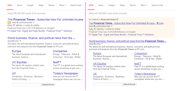
Photo Credit: Search Engine Watch
In the organic search results, Google removed the underline from the active links, including both headlines and sitelinks. They also made these headlines and sitelinks slightly larger. Some users have commented that the lack of underlines makes the new results harder to read as they scroll down the page on desktop and laptop computers.
While these seem like minor changes, they can have larger implications on webmasters and search engine optimization. The increase in text size may cause some headlines to truncate, such as in the example above. Titles that are truncated at an awkward or inappropriate position can lose meaning or lead to less clicks. Webmasters must now review all title tags and edit them accordingly. The new layout appears to be showing about 60 characters in organic result headlines, so keep your title tags under that limit.
Perhaps the most obvious change is the appearance of the sponsored ads. Google removed the yellow shaded box that used to frame the AdWords results, swapping that out for a small yellow “Ad” tag next to each pay-per-click advertising search result. You may have seen this change on your mobile phone over the past few months as Google tested the new design on mobile devices first.
Initial opinions on how the new ad layout will affect click thru rates are mixed. Some think the new layout will attract more clicks since they now look more similar to organic results. Others say the yellow “Ad” tag will make searchers more aware that these are paid results, deterring some from clicking.
New Design is Here to Stay
Google has stated that these design changes were made with mobile and tablet users in mind. This shouldn’t come as a surprise, as Google continues to preach a “mobile first” mindset to website developers. Google considers these design changes to be improvements for mobile and tablet search, and has rolled them out to desktop search to keep a consistent design across all devices.
What do you think of these design changes? Improvement or a big step backwards?
Curious how SEO or paid search can build awareness, generate leads, or increase sales? Contact our healthcare marketing agency online to learn more, or call 877-887-7611 to request a quote.
Author: +Brian Shilling