Branding

No, you can’t use Comic Sans! How to choose the perfect font for your logo

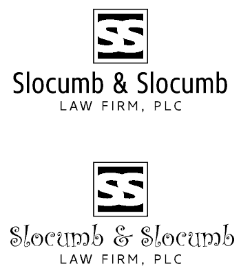
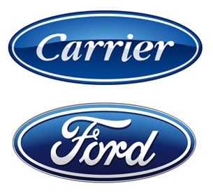
Is your logo living up to its fullest potential? Is it giving off the best first impression possible? In many cases, the font used in your logo can make or break the design as a whole. A questionable font choice can quickly derail your attempt to sway a potential customer into trusting and interacting with your brand.

Our technology marketing agency recommends these tips to determine the right font for your logo.

Choose an appropriate font

What feeling or mood do you want your logo to give off? Your brand may be serious, playful, elegant, or approachable.

Each font has its own “mood,” so it’s important to select the one that best fits your brand and connects with your target demographic. If your font isn’t communicating the same feeling as your overall messaging and design, a visual disconnect occurs that can be jolting to the viewer.

In this example, it’s easy to see which font is more appropriate for a law firm.

Visually connect the font with the logo

Even if you find an appropriate font that speaks to your brand, it won’t necessarily work with the logo you have in place. The logo (or icon) and font should share similar design traits so it looks like they belong together. They should be seen as a group rather than two separate parts of the logo.

In the TechCo example, the thick icon (with serifs) and the thin sans serif font do not share the same design characteristics, which makes the overall logo appear disjointed and off balance.

Do your competitive research

Look around at other brands you compete against and even take note of well-known brands outside of your industry. Make sure your logo’s font is different from the others. The last thing you want is to be confused with another company or be seen as a copycat.

Enjoy these examples of logos separated at birth.

Make sure your font is legible at small sizes

Your logo is going to be displayed in various sizes, and most of the time, that size is going to be very small. Test your logo’s font to make sure it’s legible on business cards, website headers, and even on faxes (seriously).

If you can’t read the text when your full logo is reduced to 1″ wide, then the text is too small.

Does your logo pass all of these tests?

If not, it may be time to revisit your logo’s design and get it on the right track before investing any more into its future.

Casey Frushour

Casey is Senior Director of Creative Services for Clarity Quest where he puts his love of puzzles and challenges to the test every day bringing ideas and brands to life in award-winning designs. To learn more about Casey's experiences and qualifications, visit our leadership team page.