
![]()
CONFERMED SUCCESS STORY
Renaming and reinventing a remote patient consultation brand
- The company formerly known as Community eConsult Network (CeCN) sought Clarity Quest’s creativity and healthcare technology marketing expertise in creating a new identity for their flagship product.
- Clarity Quest led an interactive, exploratory messaging and positioning session to introduce a new way of thinking about branding and marketing, getting all key stakeholders involved in the discussions.
- Clarity Quest helped CeCN — now ConferMED — establish their new brand voice and image in the form of new messaging, a logo, tagline and imagery.
ConferMED is creating new ways for primary care providers and specialists to interact for the improved health outcomes of their patients. ConferMED’s eConsult platform brings rapid access to specialty care to patients who otherwise may not receive it.
Stage: Private; Grant Funded
Marketing services provided
Starting with why
As a technology platform created by primary care providers at a Federally Qualified Health Center (FQHC), ConferMED is not your typical profit-driven health IT company — and it was our job to use that to their advantage.
Our team led an intensive (but fun) all-day brainstorming meeting to discover the driving forces behind ConferMED’s existence. We had to find out what made them tick, why customers would care, and how we could craft that story.
Our healthcare IT marketing agency brought that story to life in a comprehensive brand messaging playbook that will guide ConferMED’s communications strategy to position the company for success among their varied audiences and end-users.
Creating a brand…
At the top of the rebranding to-do list was renaming the company. All parties agreed that Community eConsult Network was descriptive, yet dull, and tied the company too tightly to one product. The company is all about connecting previously unconnected entities in healthcare — an ideology that reaches far beyond eConsults.
The new name is less literal than the former yet still has ties to communication, connection, and healthcare. The logomark now evokes images of mutual care and compassion with a hidden “c” and “m” that make this logo uniquely ConferMED’s.
…and sticking to it.
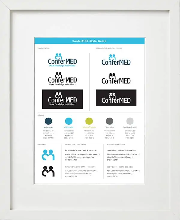
All successful brands need to adhere to strict usage guidelines to avoid misuse and confusion. For any brand we create or alter, we provide a detailed style guide to ensure all future parties who have a hand in marketing and advertising carry out the intended brand style.
ConferMED’s style guide includes all the logo variations, colors, and typography needed to maintain the integrity of the brand.
Connecting the dots
With a solid brand foundation in place, we helped ConferMED create the first collateral with the new look and feel. ConferMED plans to bring their new brand to market in 2019 with a redesigned and improved website and updated digital and printed brand assets to match.
