
 Of all the elements that need to be created and approved during website design, website banners cause the most angst. If the web stakeholder team is not fully aligned with the company’s or product’s marketing messaging and positioning, dissension is almost guaranteed to show its ugly head during the banner design and selection process.
Here are a few ways to bring peace to the homepage imagery creation process.
1. Know Your Most Important Brand Promise
Before you meet with your creative team, ask yourself, “What’s the single most important promise we make to our customers?” Agree on ONE promise before beginning your web design or redesign.
Before beginning a #design project, define the single most important brand promise. Share on X2. Ditch Sliders
Sliders, sometimes called rotating banners or carousels, are a cop out for teams that can’t decide on their most important value proposition (above). They can’t decide on ONE value proposition, so they want to throw three or four into rotating panels thinking visitors will watch the entire rotation. They WON’T.
In Why Sliders Make Your Homepage Suck, Shane Melaugh shares numerous examples that show slides negatively affect click-through rates. There’s even anecdotal evidence that sliders negatively impact SEO rankings.
When we eliminated our sliders a few years ago in favor of a singular narrow banner, we saw a definite improvement in time on page and click throughs.

3. Websites are Easily Updated
Many young companies testing their brand promise are afraid of making a mistake and tainting their audience’s perception. We rarely see companies get a brand promise completely wrong, but tweaks are often necessary.
Luckily, a website banner isn’t an etched tombstone you have to live (or die) with forever. In fact, it should ideally change once per quarter. It’s the easiest facelift you can give to your site without redesigning the whole thing. Change your homepage banner and you’ll be amazed at how many people ask if you have a new site.
4. Don’t Ignore Subpages
Over the past six months, only 20% of our visitors landed on the Clarity Quest homepage. The other 80% landed on over 300 different pages on our site! If you take too much time debating about the homepage banner, you leave little time and creative brain cells for the other pages, which are extremely important as landing pages.
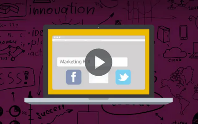
5. Video is An Attractive Alternative
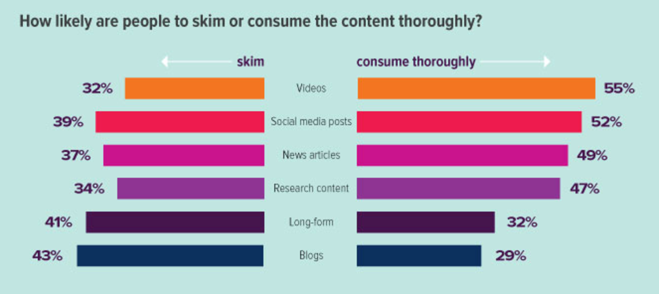
If you can’t tell your story in one big fat headline and simple image, consider video. While people won’t engage with sliders, they do tend to consume videos more thoroughly than other pieces of content.
There are quality video production houses that will produce an intro educational video for less than $3,000. One of our favorites is Epic Dog Studios.
Your Turn
What have been the toughest challenges of website design for your organization? We’ll respond to all comments and questions and may even have a good piece of advice for you.
