For logo design inspiration, our health tech digital marketing agency studies a combination of top-performing companies, from the Fortune 100 to the well-funded startups stealing the spotlight.
In particular, we often look to technology organizations to gauge the pulse on the latest trends as well as what will endure the test of time. As a result, we’re better equipped to develop a bold visual identity that will help clients stand out in the sea of sameness.
Company logos are the anchor around which brand identity is built. As technology changes, it’s essential that established brands evolve with the times—this is often most easily accomplished with a logo refresh.
Following are a few timelines and stories behind the evolution of tech company logos:
Apple: From storybook to sleek
The original Apple logo looks like a page from a children’s fairytale book.
It shows a detailed scene of Sir Isaac Newton sitting under an apple tree. Along the border, it reads: “Newton… A mind forever voyaging through strange seas of thought… alone.”
In 1977, Apple streamlined its logo by creating a simple but colorful icon. There are many legends about the symbolism behind the iconic Apple bite. According to the designer, Rob Janoff, the bite was merely intended to ensure the apple would not be confused with a cherry.
Over the years, Apple has experimented with bevel and shadow effects. “One of the main reasons for coming up with the monochrome logo was that the new Mac computers were being manufactured with metal casing instead of the plastic one and the sight of a rainbow logo on a metal computer did not fit well.”
The current Apple logo is simple and minimal.
GE: From art nouveau to smooth and elegant
For more than 125 years, General Electric (GE) made only slight modifications to its brand. The original GE logo was in an art nouveau style with long, organic lines. Over time, it has become more circular, fluid, and smooth.
In 2004, GE underwent its first and only significant rebranding.
The new logo incorporated the color blue, which communicates trustworthiness, intelligence, and commitment. In addition, GE’s tagline changed from “We bring good things to life” to “Imagination at work.”
Google: From playful 3D to approachable
According to Neatorama, Google was originally named “BackRub” for its ability to analyze backlinks to determine a website’s relevance. It was later renamed Google, a play on the word Googol, which means one followed by 100 zeros.
The original Google logo featuring 3D lettering is reminiscent of Microsoft WordArt.
In 1998, Google introduced its now well-known daily modification known as the Google Doodle.
According to the Google Doodle Archive, “Google founders Larry and Sergey played with the corporate logo to indicate their attendance at the Burning Man festival in the Nevada desert. They placed a stick figure drawing behind the 2nd ‘o’ in the word, Google, and the revised logo was intended as a comical message to Google users that the founders were ‘out of office.’”
Over the years, Google’s company logo has become lighter, simpler, and more approachable.
Google’s current logo features a highly recognizable custom geometric sans-serif typeface called Product Sans.
IBM: From antique monogram to modern classic
IBM’s first logo dates back to 1888, making it one of the most veteran tech logos of all time. As they went through various name changes, from International Time Recording Company to Computing-Tabulating-Recording Company to what it is today, International Business Machines, each name change demanded a new logo design.
The first IBM logo was created in 1924. According to IBM, “Watson Sr. chose a more contemporary sans-serif type versus the ornate, rococo letters that formed the previous “C-T-R” logo. The words “Business Machines” were intended to suggest a globe, girdled by the word ‘International.’”
While their current logo isn’t incredibly contemporary, its classic modern vibe reflects the company’s longevity and reinforces the old adage, ‘Nobody ever got fired for buying IBM.’
Microsoft: From disco to clear and flat
Microsoft has gone through many iterations.
The original Microsoft logo, with its fun font, gave off serious disco vibes. Their 1982 logo update came with a distinctive ‘O’ that employees dubbed the ‘Blibbet.’
The launch of Windows 8 ushered in flat design and today, this style represents fast loading times and responsive websites. Five years later, this was simplified to a slash and often referred to as the “Pacman” logo.
Today, the Microsoft logo is colorful, simple, and clean—desired attributes we often hear from our clients.
Final thoughts on identity: Simplicity is the name of the game
Reflecting on how these leading tech companies have evolved their logos over time, some have changed drastically, while others have barely changed at all.
Some companies have updated their logos many times, while others have refreshed their marks only a couple of times over many years.
The one connecting thread I see throughout these changes is a move toward simplification.
With the majority of individuals engaging with brands (even B2B ones) on websites and social media, being easily recognizable in 150 x 150 pixels is a business imperative.
Can you imagine that original Apple logo in your LinkedIn feed? It would be unreadable.
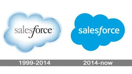
I also find it interesting that two of the biggest tech players in marketing, Salesforce and HubSpot, have had minimal logo redesigns, having led with simplicity from the start.
Need a tech company logo refresh?
If you’re thinking about a tech company logo refresh, be sure to check out our portfolio.
Note: This blog post was originally published January 22, 2019, and has been updated to reflect current information.


