
Some companies update their corporate logos with great results. Successful design changes are usually aligned with corporate policy updates, mergers and acquisitions, leadership changes, or larger rebranding efforts.
Other logo redesigns leave consumers scratching their heads. Remember the Gap logo debacle of 2010?
We’ve analyzed 10 logos from 10 different industries that have undergone minor or significant changes in the past year. What do you think of these new logos?
Apparel
 |
 |
| BEFORE | AFTER |
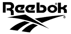
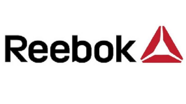
The Good: After years of living in the shadows of Nike and Adidas, Reebok has rebranded to target the everyday fitness market. The new logo is a “symbol of change.”
The Bad: Reebok has changed its logo over 10 times since the mid 1980s. I don’t think the logo will have much of an impact on Reebok’s profits, but the new market focus may be the differentiator the company needs.
We Give It: 6/10
Athletics
 |
 |
| BEFORE | AFTER |
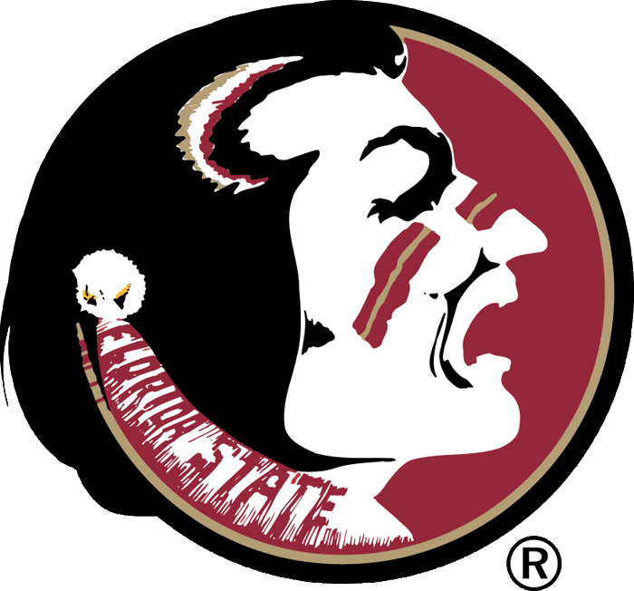
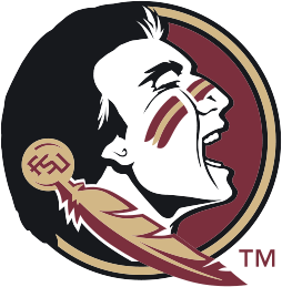
The Good: With the best intentions, Florida State designed a new logo to reproduce better in different formats, sizes, and textures; to institute consistency in color pallets; and to honor their Seminole heritage. A boost in merchandise sales doesn’t hurt either.
The Bad: The Seminole faithful did not react well to the new logo. But once the design was introduced on new uniforms, football helmets, and field designs, fans were much more receptive to the changes. Remember, presentation and circumstance can have a huge impact on perception and favorability.
We Give It: 7/10
Entertainment
 |
 |
| BEFORE | AFTER |
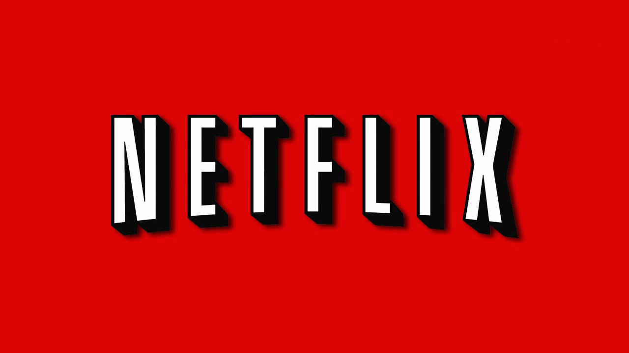
The Good: The shape and font build on the popularity and recognition of the old logo while the flat design introduces a modern trend. Bonus points for giving us cheap access to movies, TV, and original shows!
The Bad: Some say ditching the bold 3D typeface loses the iconic Hollywood studio feeling. But is that such a bad thing?
We Give It: 9/10
Finance
 |
 |
| BEFORE | AFTER |
The Good: The new hand-sketched feel is meant to make the company more relatable to customers. Most importantly, the logo refresh was accompanied by a website and interface upgrade to bring design and functionality in line with consumer expectations.
The Bad: PayPal still has some work to do to meet consumer requests for new functionality, but the changes made within the past year are a major upgrade.
We Give It: 7/10
Food & Beverage
 |
 |
| BEFORE | AFTER |
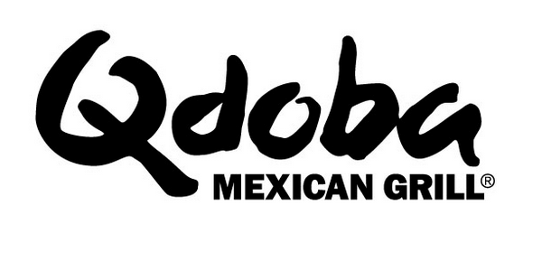
The Good: In an effort to differentiate from the many fast-casual Mexican restaurants, Qdoba decided to step out of the box by hiring a new brand president, introducing bolder flavors, restructuring menu pricing, and testing new in-store designs – a calculated, phased approach that is paying off in sales growth.
The Bad: When I first saw the new logo in person, I did not recognize the store as my beloved burrito shop. But if the consumer research and sales continue to support the overall brand changes, then I’m on board.
We Give It: 7/10
Healthcare
 |
|
| BEFORE | AFTER |
The Good: A 2014 merger of three premier Michigan-based health systems, now known as Beaumont Health, called for a rebranding to bring all hospitals and clinics under the same branding umbrella. Hospital names now also include the city name to connect with residents in each location. Cobalt blue was a great color choice for the new health system to convey trust, dependability, and integrity.
The Bad: Brand consolidation is never an easy undertaking, especially when merging large healthcare organizations with disparate facilities, physician offices, and advertising initiatives throughout the state. The brand update could take over one year to complete, potentially leaving customers confused during the transition. However, the changes are necessary and the payoff is worth the effort.
We Give It: 8/10
Hospitality
 |
 |
| BEFORE | AFTER |
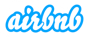
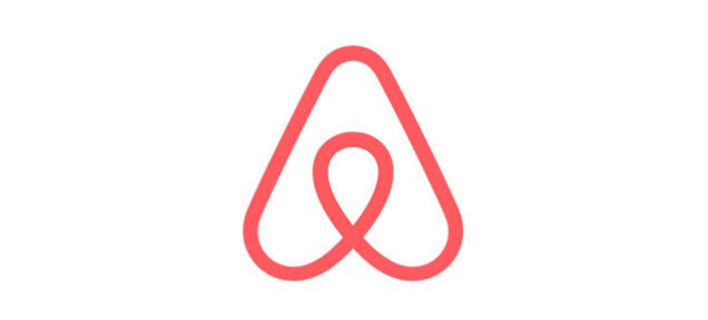
The Good: Airbnb reportedly conducted lots of research to ensure the logo worked across the globe – which is a key consideration for a travel and hospitality company. According to Airbnb, the logo conveys a sense of connectedness between people and places around the world.
The Bad: Similarities in logo designs can be found in any industry. But Airbnb’s new design is under fire for looking nearly identical to an existing brand, although this has apparently been worked out between the two companies. The lesson here is to do your research before committing to a new logo design.
We Give It: 4/10
Pharmacy
 |
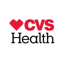 |
| BEFORE | AFTER |
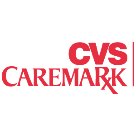
The Good: The CVS logo is a great fit for the company’s new corporate direction in which they rebranded as CVS Health, banned cigarette sales from all stores, and made a deep commitment to improving health outcomes.
The Bad: The typeface of “Health” – perhaps in an effort to match the Caremark portion of the old logo – competes with the rest of the design. The new logo leaves a little to be desired, but there is something to say for simplicity.
We Give It: 6/10
Technology
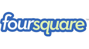 |
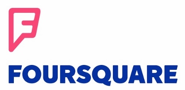 |
| BEFORE | AFTER |
The Good: The new logo design was released in conjunction with an effort to rebrand Foursquare into two apps: one for social check-ins (now Swarm) and one to compete with Yelp for recommendations and ratings.
The Bad: The best intentions don’t always pan out. Foursquare has gotten backlash from users on its restructuring. The maligned logo is just the cherry on top.
We Give It: 3/10
Travel
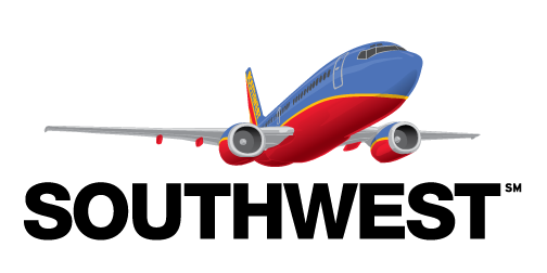 |
|
| BEFORE | AFTER |
The Good: Southwest’s new heart design symbolizes warmth and caring – feelings passengers look for as part of their travel experience – to set them apart from airlines who continually take away legroom, nickel and dime for luggage and amenities, and seem more focused on profits than passengers. The move fits the trend we’re seeing with other airlines to make flying more personal and enjoyable.
The Bad: Some believe the rebranding should have been done after the company tackled issues with late arrivals, lost baggage, and ongoing labor disputes.
We Give It: 8/10
Considering a logo redesign? Consult with an experienced branding agency to ensure your graphic design is aligned with your corporate identity.
Like this post? Get more juicy marketing content by signing up for our monthly e-newsletter.
